
Visualizations vs. Paginated Reports: A Comparative Analysis
In the world of data analysis, the way we present data can significantly impact the resulting insights. Two popular methods of data presentation are visualizations and paginated reports.
Let’s delve into these two methods and understand their strengths and weaknesses.
Understanding Paginated Reports
Paginated reports, often traditional reports, are detail-oriented and organized in a tabular format. They are ideal for generating fixed-layout documents with many pages, making them perfect for printing a PDF or exporting to Excel for further analysis.
Consider the following sales data listed by customers:
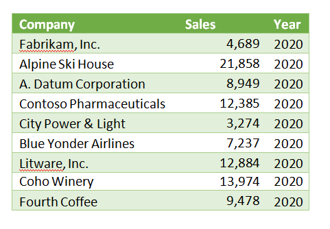
This simple table with rows and columns is a paginated report. Each row contains the key columns of data. Often, paginated reports are several or many pages long, with the column headers repeated at the top of each page and summaries or totals at the end of the report.
Paginated reports provide detailed information often used as a reference document for backup or decision-making, like an encyclopedia or dictionary.
Paginated Reports are not designed for analysis as delivered. However, they can be a source or input to visualization or analytical reports.
The Power of Visualizations
While paginated reports are great for detailed data listing, visualizations help us understand complex data sets at a glance.
For instance, presenting the sales data seen in the paginated report above in a pie chart makes it much easier to see which customers contribute the most to sales.
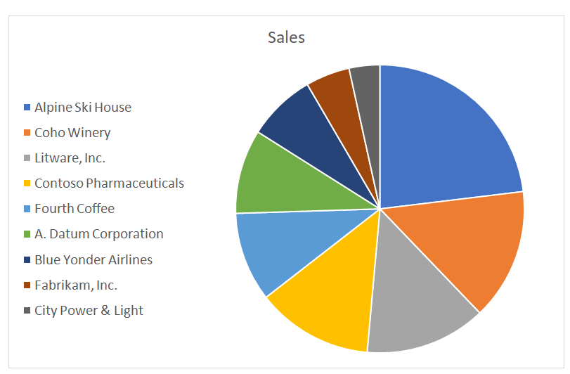
Visualizations such as pie charts help us see parts of a whole. Similarly, line graph charts are excellent for tracking changes within a single group over time.
Conditional Format & Pivot Tables: Game Changers
Conditional formatting and Pivot Tables are powerful Microsoft ExcelTM tools that help us quickly understand data lists. They allow us to highlight anomalies and groups of similar data readily.
For example, consider the chart below.
We’ve highlighted Revenue above 10,000 in green and less than 8,000 in red. Even though we have three times as much data as in our first table, we can now easily discern which companies and years are high and low performers.
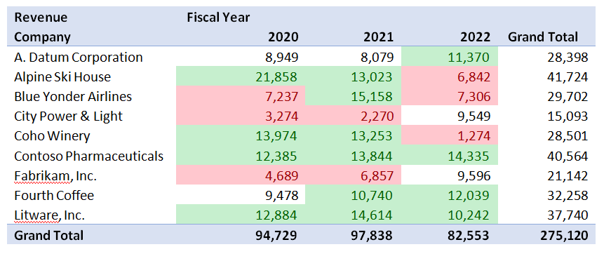
These tools have limits and challenges. Conditional Format is helpful when the lists are at most 20 or 30 highlighted elements. Pivot tables are easy for some people to manipulate and just not for others.
Self-Service Analysis with Visualizations in Power BI
We benefit when users with varying Excel skill levels can still see the trends of our key metrics, like sales. How do we accomplish this? With self-service Power BI.
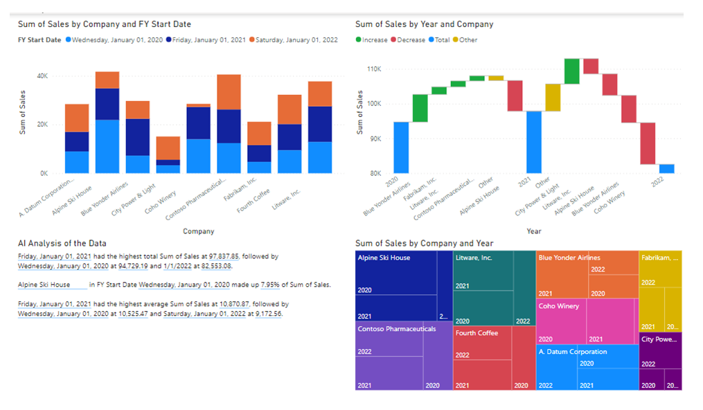
Power BI provides even more advanced visualizations, including numerous charts with drill-throughs, automated workflows, and even an AI engine to help interpret the data and identify trends and anomalies.
Below is an example of a single page of 4 visualizations in Power BI against the same data that created the Pivot Table above.
Conclusion
Both visualizations and paginated reports have unique strengths in presenting data effectively and efficiently.
Are you ready to leverage the power of visualizations and paginated reports for your business? Get in touch with our team today!
Remember: Data is only as good as how you use it! Let’s unlock its potential together.