[fusion_builder_container type=”flex” hundred_percent=”no” equal_height_columns=”no” menu_anchor=”” hide_on_mobile=”small-visibility,medium-visibility,large-visibility” class=”” id=”” background_color=”” background_image=”” background_position=”center center” background_repeat=”no-repeat” fade=”no” background_parallax=”none” parallax_speed=”0.3″ video_mp4=”” video_webm=”” video_ogv=”” video_url=”” video_aspect_ratio=”16:9″ video_loop=”yes” video_mute=”yes” overlay_color=”” video_preview_image=”” border_color=”” border_style=”solid” padding_top=”” padding_bottom=”” padding_left=”” padding_right=””][fusion_builder_row][fusion_builder_column type=”1_1″ layout=”1_1″ background_position=”left top” background_color=”” border_color=”” border_style=”solid” border_position=”all” spacing=”yes” background_image=”” background_repeat=”no-repeat” padding_top=”” padding_right=”” padding_bottom=”” padding_left=”” margin_top=”0px” margin_bottom=”0px” class=”” id=”” animation_type=”” animation_speed=”0.3″ animation_direction=”left” hide_on_mobile=”small-visibility,medium-visibility,large-visibility” center_content=”no” last=”true” min_height=”” hover_type=”none” link=”” border_sizes_top=”” border_sizes_bottom=”” border_sizes_left=”” border_sizes_right=”” first=”true”][fusion_text columns=”” column_min_width=”” column_spacing=”” rule_style=”” rule_size=”” rule_color=”” hue=”” saturation=”” lightness=”” alpha=”” content_alignment_medium=”” content_alignment_small=”” content_alignment=”” hide_on_mobile=”small-visibility,medium-visibility,large-visibility” sticky_display=”normal,sticky” class=”” id=”” margin_top=”” margin_right=”” margin_bottom=”” margin_left=”” fusion_font_family_text_font=”” fusion_font_variant_text_font=”” font_size=”” line_height=”” letter_spacing=”” text_transform=”” text_color=”” animation_type=”” animation_direction=”left” animation_color=”” animation_speed=”0.3″ animation_delay=”0″ animation_offset=””]
PivotTable Quick Guide
In the era of data-driven decision-making, the PivotTable is a powerful tool that allows users to analyze and interpret complex datasets quickly by creating an interactive summary of the information.
This blog post aims to guide decision-makers and influencers in small to mid-market companies on how to best leverage PivotTables for their data analysis needs.
What are PivotTables?
PivotTables are a feature of Microsoft Excel that enables users to transform columns into rows to extract meaningful insights from our data.
It allows us to perform aggregations or totals such as average, minimum, or maximum, enabling us to understand our data better and make better decisions.
How Do PivotTables Work?
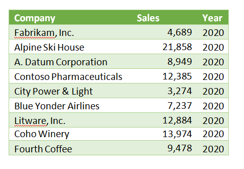
Let’s consider an example where we have sales data for several customers over three years from 2018 to 2020:
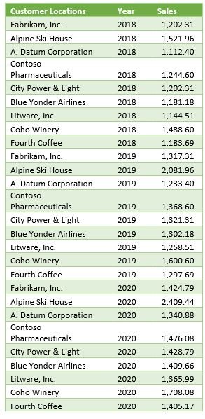
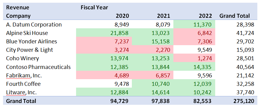
From the table above, it isn’t easy to quickly discern any customer’s total sales or which customers have the most or least sales in any year. That’s where the magic of PivotTables comes in. With a few steps in PowerPivot, we have a sortable table broken out by year and company.
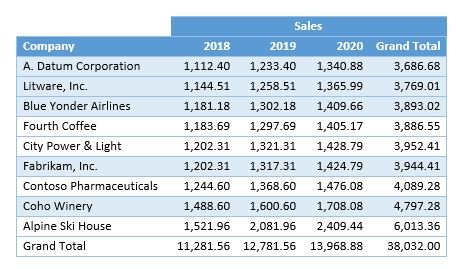
This PivotTable lets us see each customer’s sales trends over time.
The Caveat
While PivotTables are a powerful tool, it’s important to note that not everyone might find it easy to use.
There are alternatives to ensure everyone benefits from more significant data insights. In Excel, conditional formatting and charts may help them understand the data better.
Another option is to take advantage of PowerBI, which separates the data design from information consumption – making it more accessible to a broader user set.
Getting Started with PivotTables
Check out our video to get started, or follow these quick steps to try out Pivot Tables in Excel:
- In Microsoft Excel, click on Insert.
- Click on PivotTable.
- Select your data range and click Insert PivotTable.
- You can insert a new sheet by default or select an existing location.
- Once there, you will see an empty table where you can build your Pivot.
- You can select fields from your data set and drag them into the rows and columns to visualize your data.
- You can add data to the upper left to filter.
Are you ready to leverage the power of PivotTables for your business? Get in touch with our team today! Let's unlock the potential of your data together.
[/fusion_text][fusion_video video="https://test.wingdingitbiz.com/wp-content/uploads/2021/10/TechHouse-PowerPivot-Intro-1.mp4" video_webm="" width="100%" controls="" preload="" loop="no" autoplay="no" mute="yes" preview_image="" hide_on_mobile="small-visibility,medium-visibility,large-visibility" class="" css_id="" overlay_color="" hue="" saturation="" lightness="" alpha="" border_radius_top_left="" border_radius_top_right="" border_radius_bottom_right="" border_radius_bottom_left="" box_shadow="no" box_shadow_vertical="" box_shadow_horizontal="" box_shadow_blur="0" box_shadow_spread="0" box_shadow_color="" alignment="" margin_top="" margin_bottom="" /][/fusion_builder_column][/fusion_builder_row][/fusion_builder_container]